UX/UI Design
iOS/Android
Team
1 Designer, 1 Project Manager, 2 Developers, 1 QA
Year
2018
Challenge
Goal
First, we met with stakeholders to understand the domain, understand the limits of the hardware and software that we would be integrating with, and form the vision of the terminal app. Then, we talked with users already using SpotOn services, but using a different company's mobile payment solution. This helped us get a deeper understanding of their journey and pain points, and helped firm up must-have requirements for our minimum viable product. Data was synthesized and translated into requirements. From here, I mapped out the flows for the application, and began work on screens for these flows.
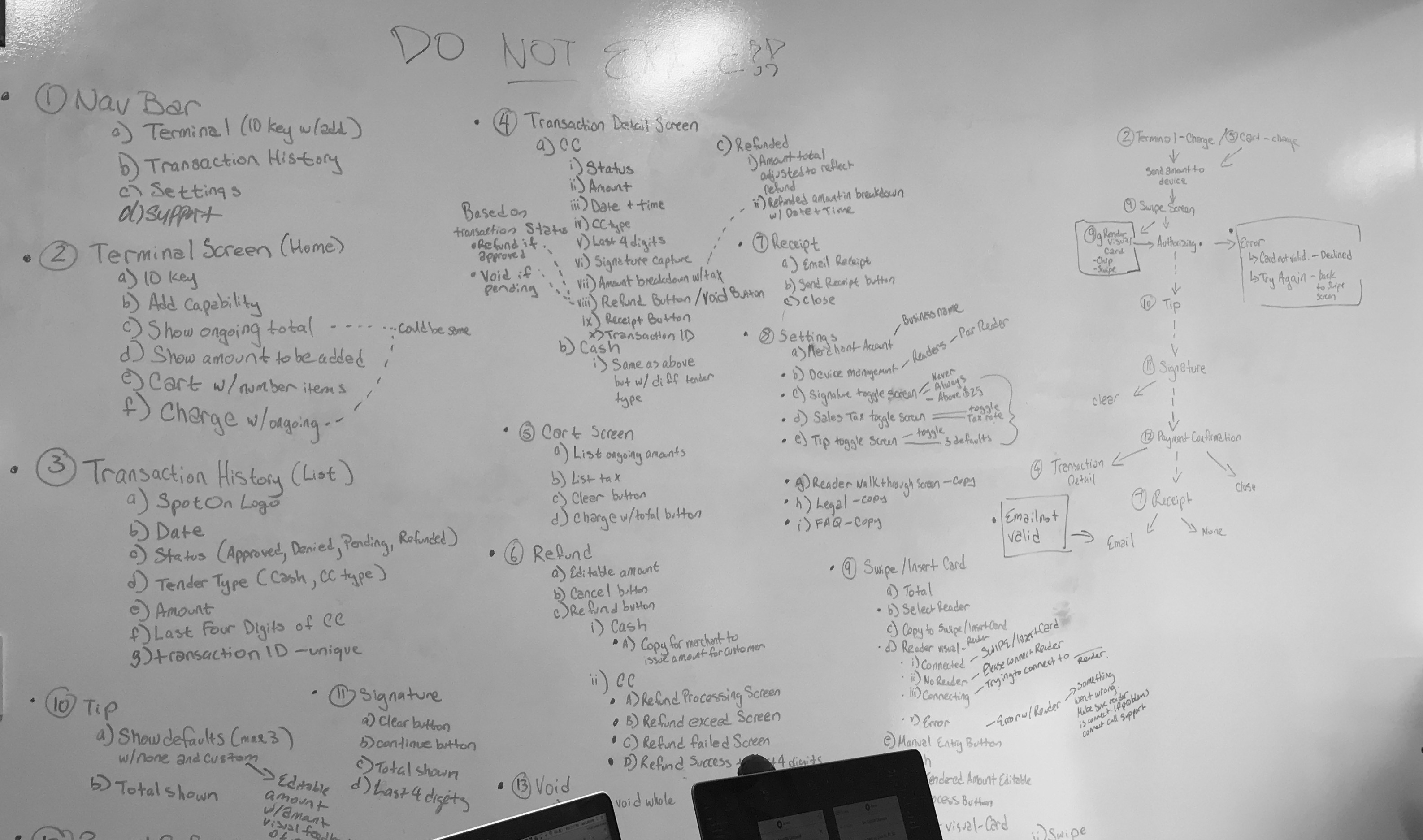
Whiteboarding out requirements and information architecture
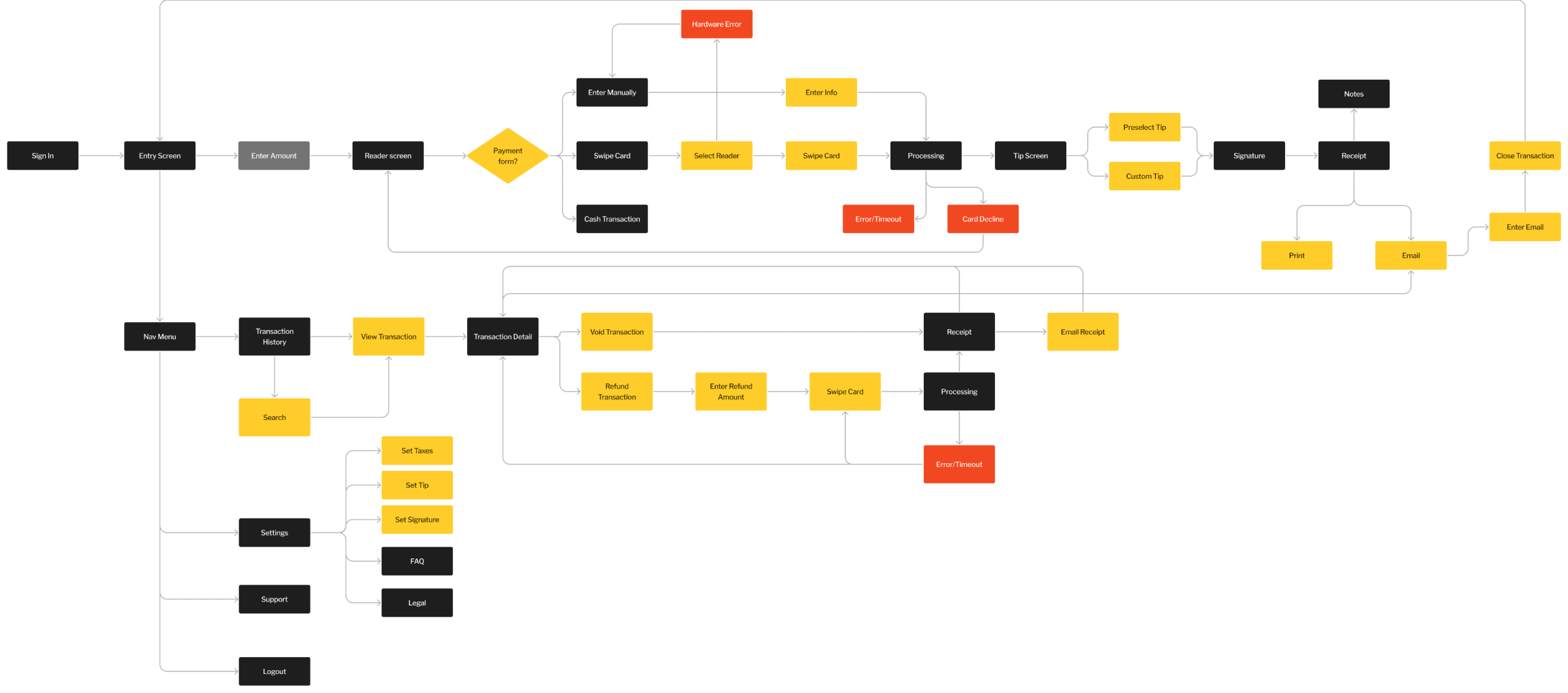
Flowchart for the application
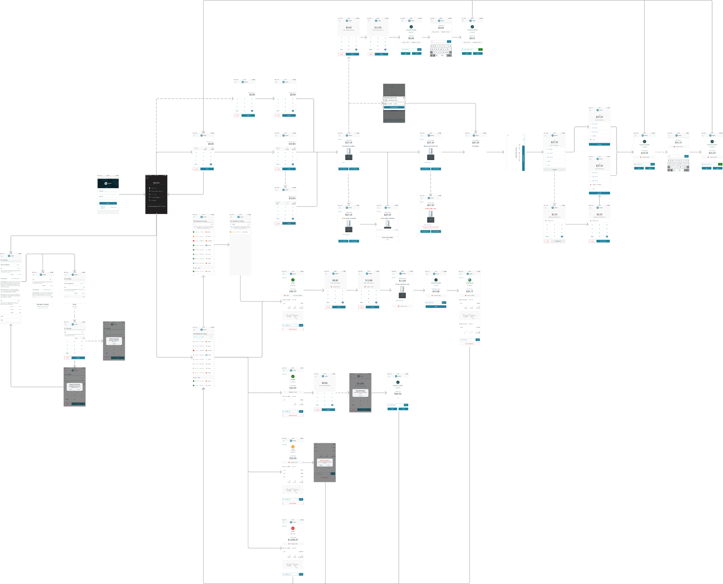
Screenflow of the application
Iterate, Test
From here, screens were designed in Sketch and then brought into InVision to prototype the three most important flows
A successful credit card purchase
A refund from the Transaction History
Setting the default tax rate for transactions
We used hallway testing to validate these flows as well as glean insights about the experience.
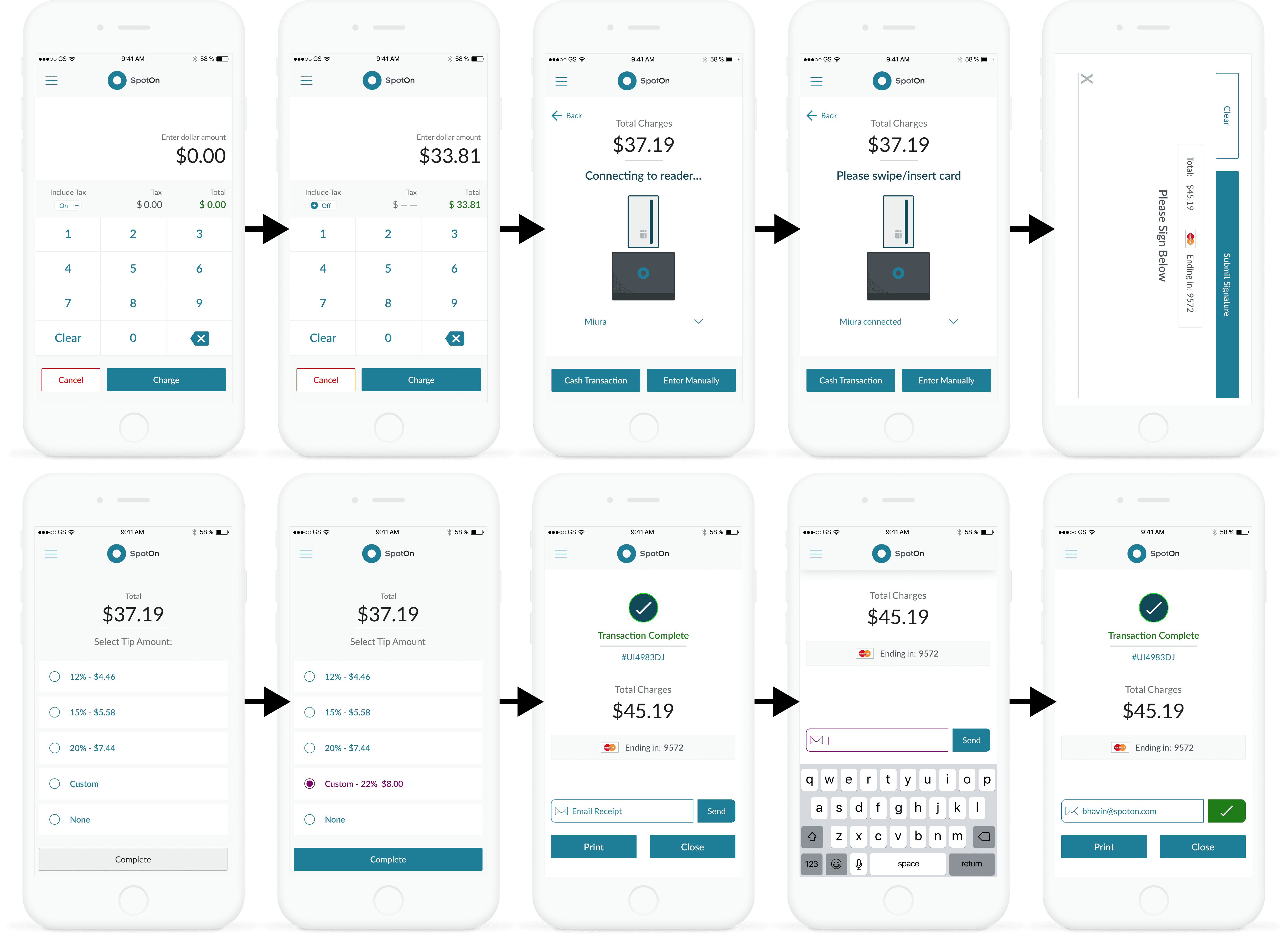
The happy path flow of a transaction
Working within an ecosystem
Due to previous work I performed on other SpotOn consumer and business facing mobile apps, there was already a visual language that we could pull from to compose these screens using the same components to ensure a consistent experience across the suite of SpotOn products. This made it easier to jump directly into designing high-fidelity screens, giving us better buy-in with stakeholders, as well as move faster into prototyping these flows for hallway testing to see what was missing from the transaction experience.
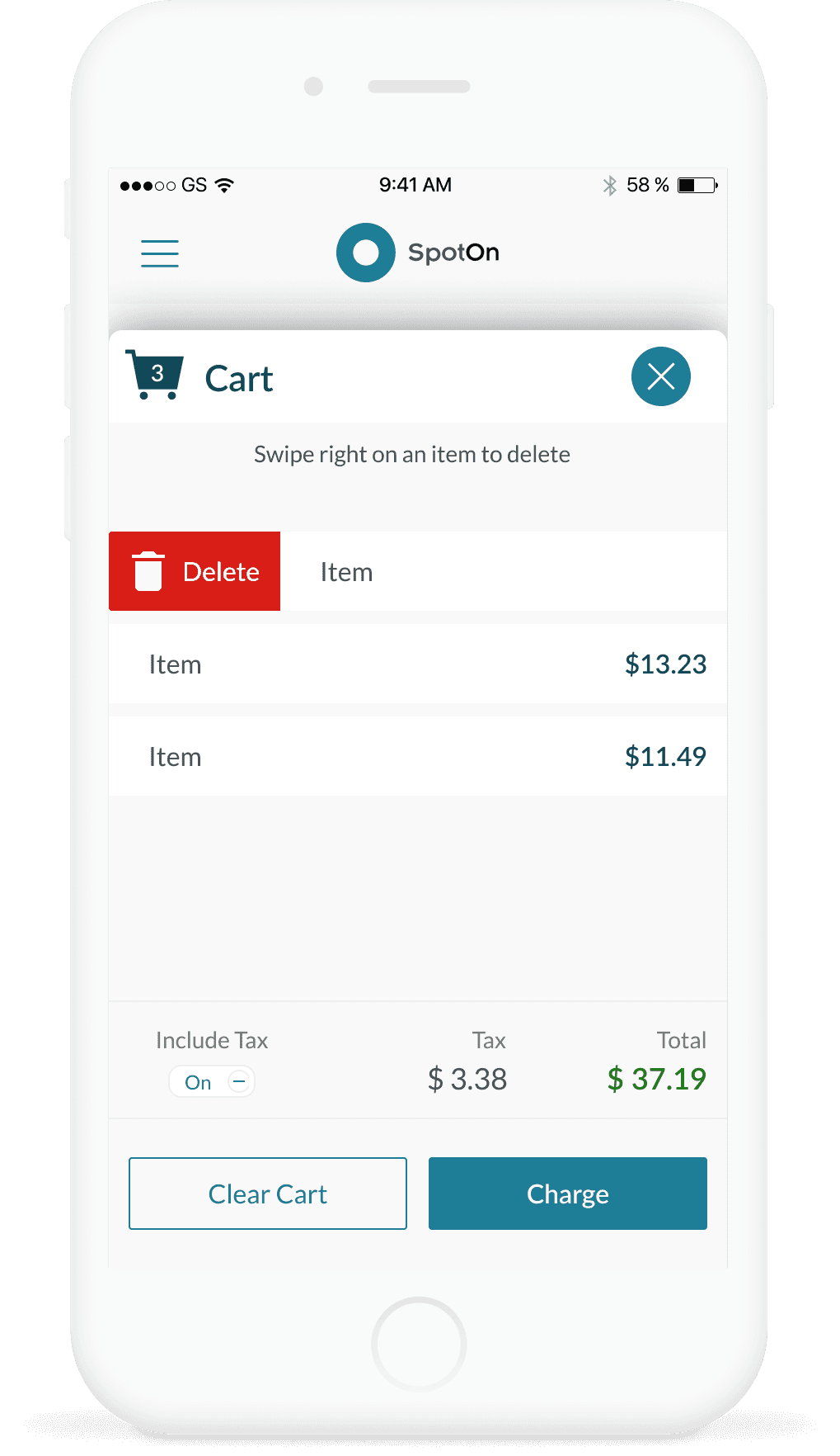
Pivoting on feedback
Since other SpotOn products included a more robust shopping cart experience, one iteration involved including a cart flow where the business can add individual items. What was found in hallway testing was that the cart system was either unnecessary for what the user was trying to accomplish on a mobile terminal, or was a longer and more confusing interaction. From here, the focus became on a single-input transaction experience for our MVP.
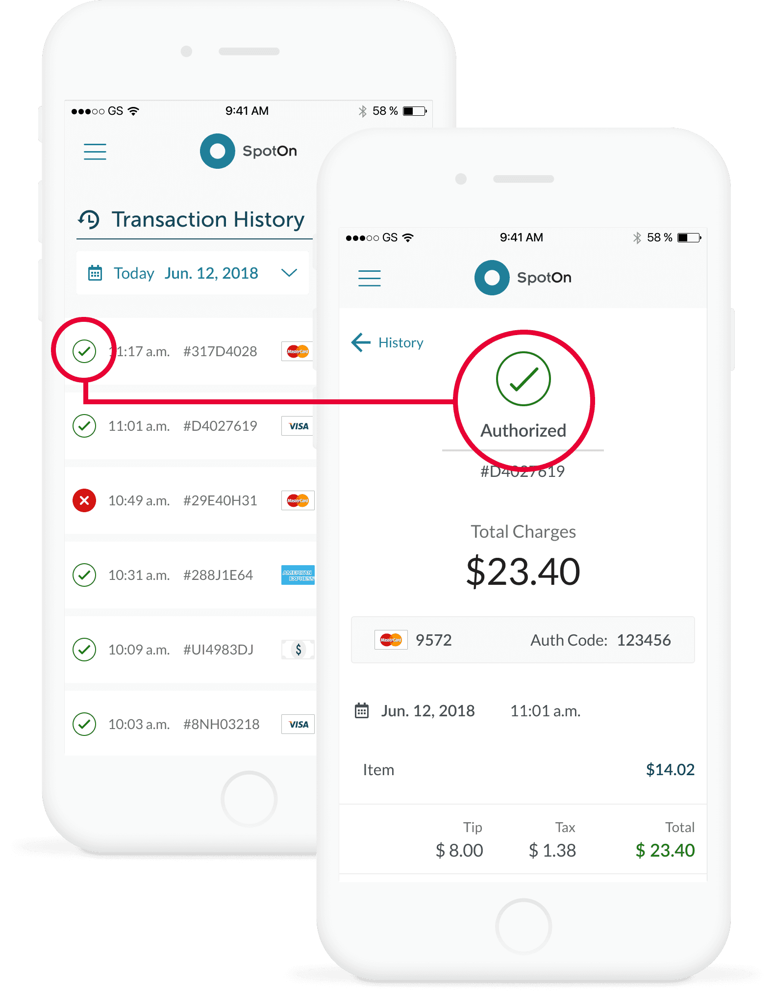
Users were enthusiastic for versions of the transaction history and detail pages that used color and iconography to give glanceable information about order status.
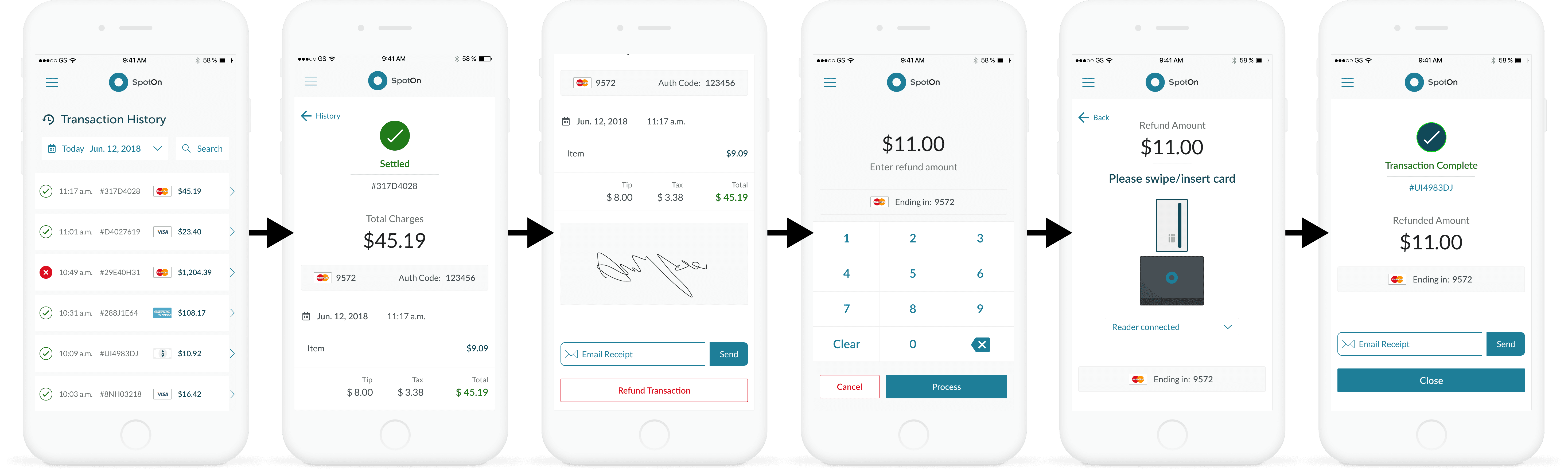
The user can navigate to a Transaction History page in order to facilitate refunds and resending receipts to customers for previous transactions
Impact
This initiative was instrumental in meeting a business goal of filling the hole in the product offering lineup in order to better serve a different segment of small business merchants. Successful iOS development led to the development of an Android version when resources allowed, and the mobile terminal served as a foundation for creating a virtual web terminal offering later.