UX Design
User Flows
Team
3 UX Designers, 1 Product Manager
Year
2016
Challenge
Goal
Research
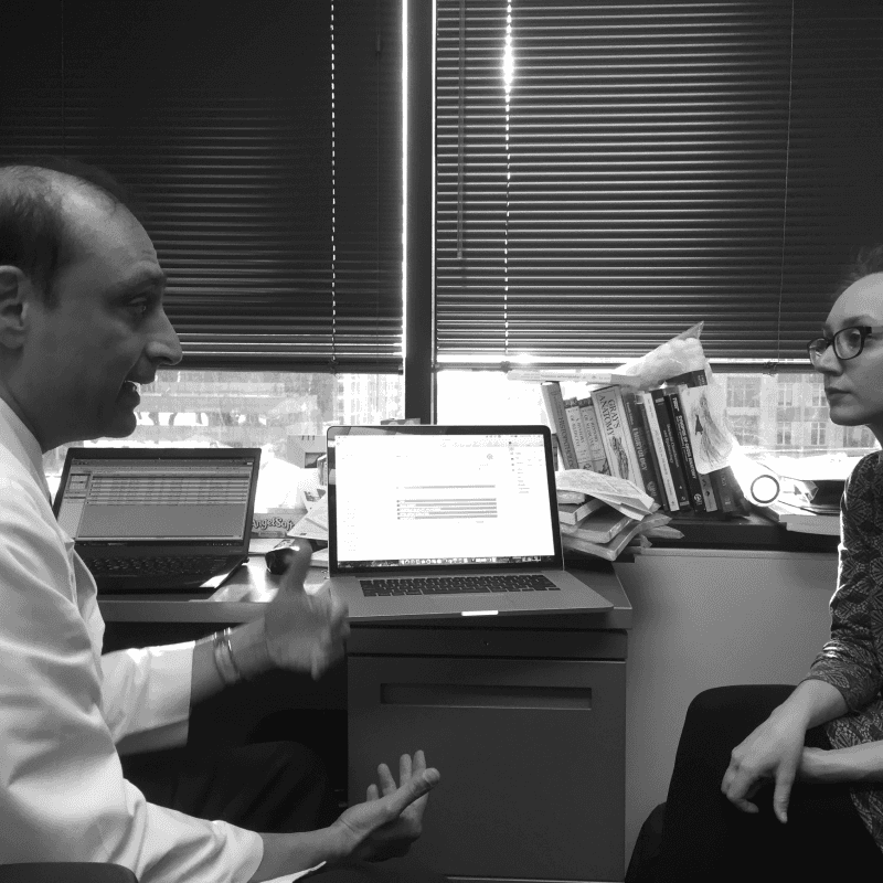
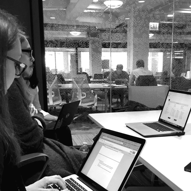
Our initial research methodology was concerned with first analyzing the domain, which proved to be quite tricky due to the complexity of the American healthcare system, and the opaque nature of other healthcare startups concerned with cost reduction. From there, we pivoted to focus our efforts on our second method of research, interviewing doctors themselves on their day-to-day routines, as well as having them perform initial usability testing with the initial prototype we were given from the client.
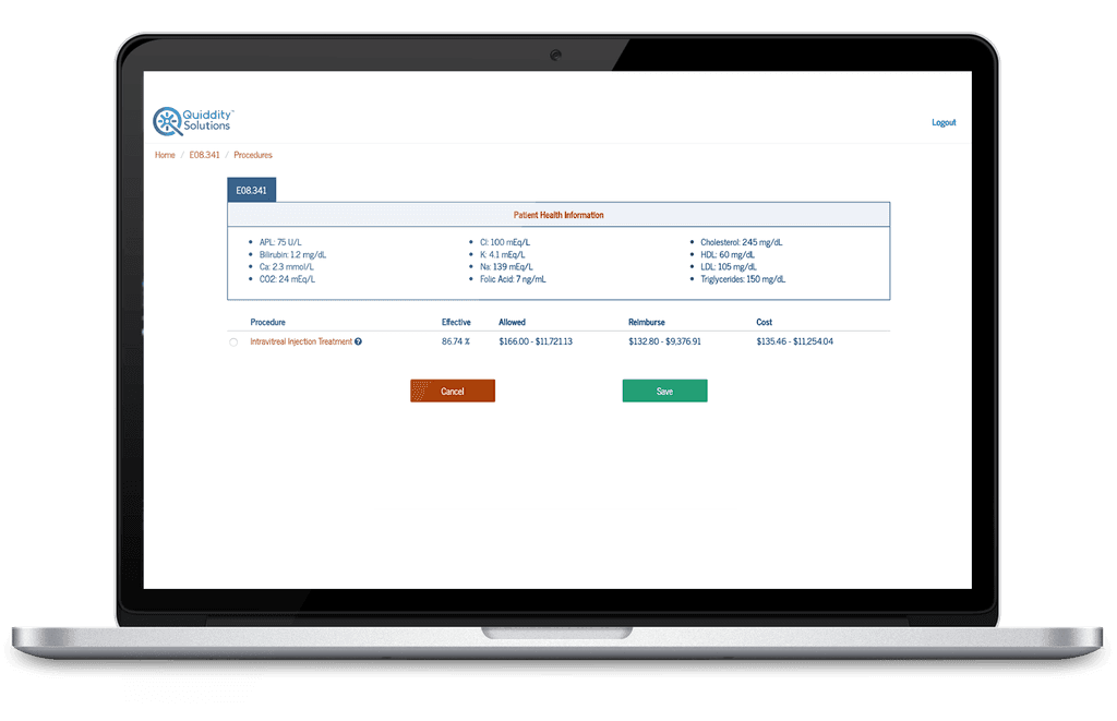
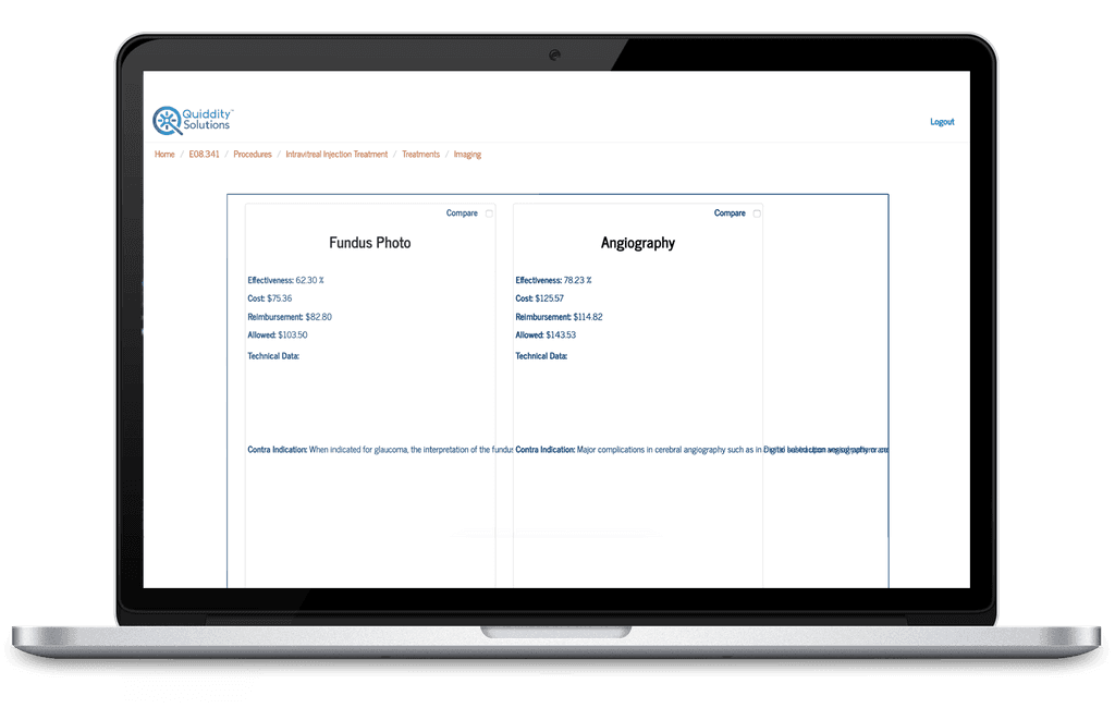
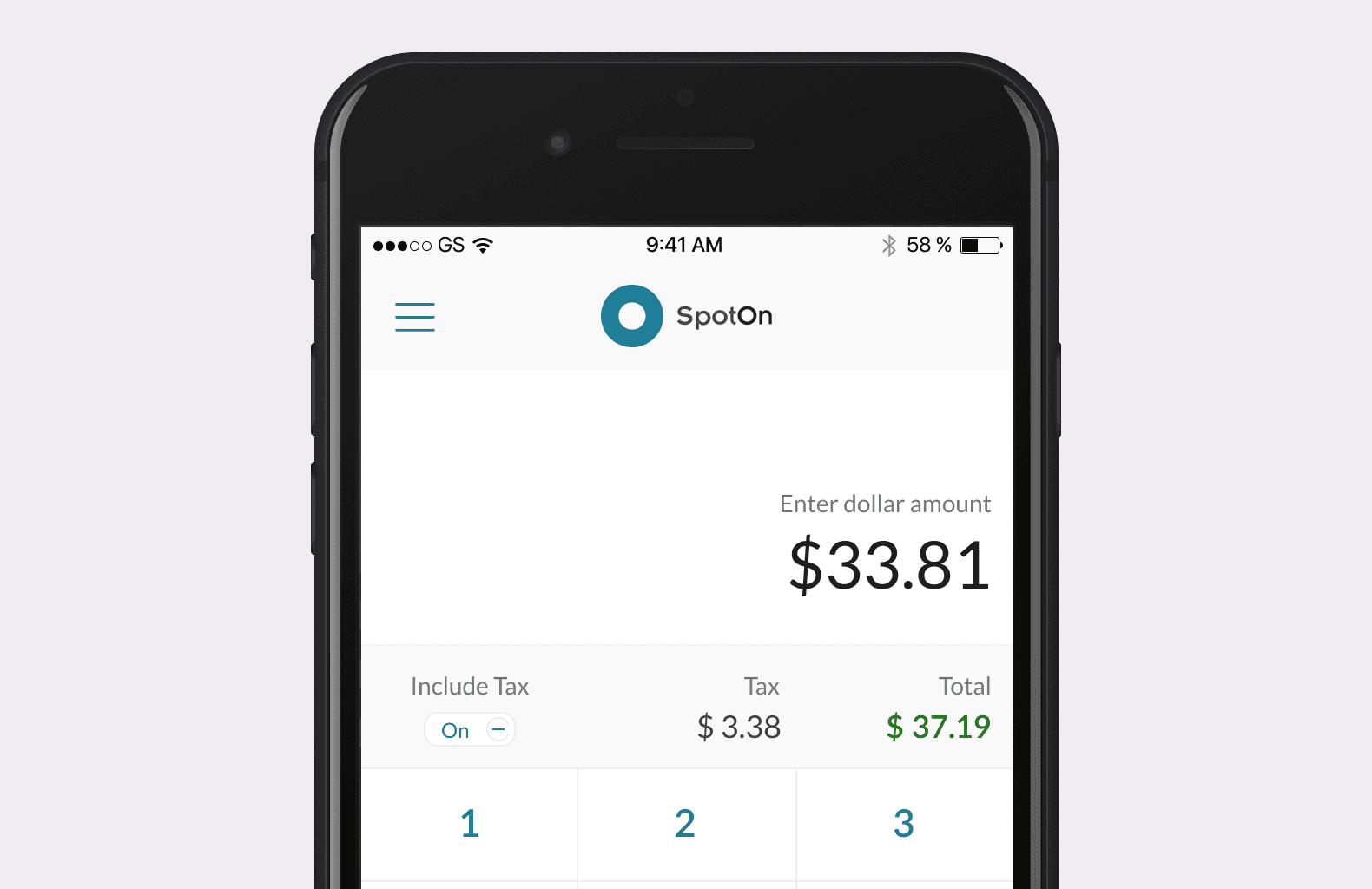
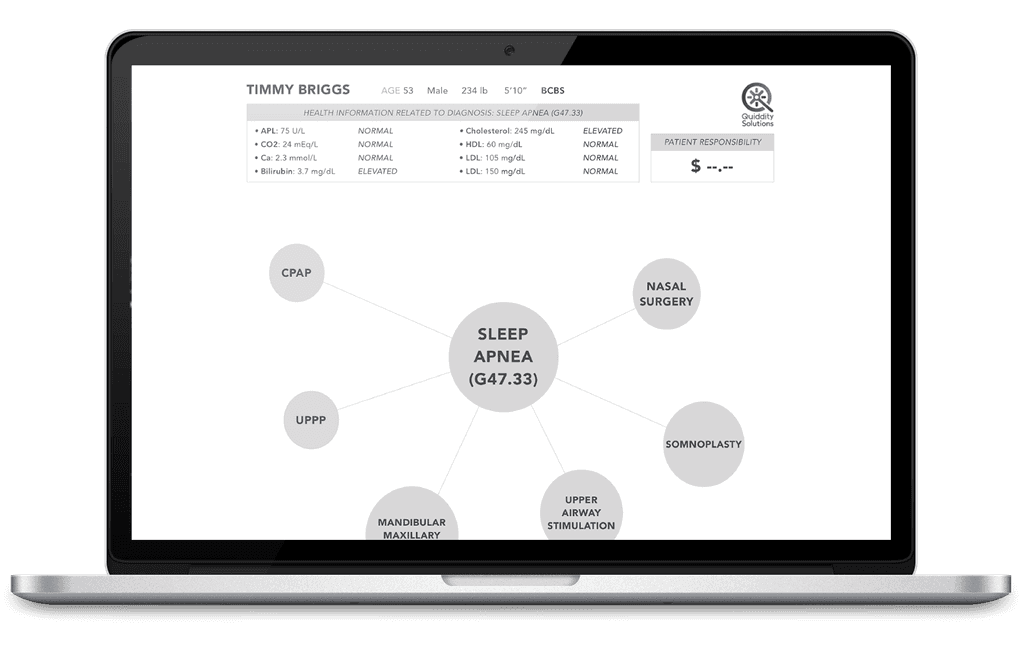
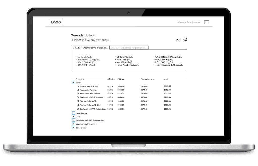
Initial prototype screens provided by client
What we discovered in our research is that doctors currently experience several pain points in the exam process that we had not anticipated. Most large medical facilities as well as small private practices have moved from traditional paper notation to Electronic Health Records (EHR) and Electronic Medical Records (EMR), which can be cumbersome and difficult to use, due to their interfaces being more akin to accounting software than exam software. Having to use these platforms takes valuable time away from patient interactions, which are already too brief by their standards. Further, the doctors noted that they have reservations that when cost is concerned in treatment, as they want patients to view them as allies, rather than “businessmen trying to make a buck.”
After synthesizing our research, we formulated our problem statement and design principles for our iteration moving forward
Time-strapped physicians need access to accurate procedure and drug costs to better navigate an increasingly cost-conscious healthcare landscape in a way that:
Forefronts improved patient care
Fits efficiently into the physician workflow
Enhances, as opposed to erodes, trust and transparency with the patient
We will help doctors build trust with their patients by providing reliable, contextualized information
We will facilitate an open and honest conversation between patients and doctors, taking into account the realities of the health insurance landscape
We will provide a simple platform with minimal data entry to help doctors make the most of the limited time they have with patients
We will set ourselves apart from other healthcare software by emphasizing quality and context of data over quantity
Physicians resent the idea that patients and medicine can be reduced to an algorithm; we will help doctors keep patient care at the center of their work
Formulating the statement and establishing our design principles helped us move forward into the iteration process by giving us a clear goal of what we were trying to solve, as well as giving us a framework for what we absolutely needed to consider in achieving that goal.
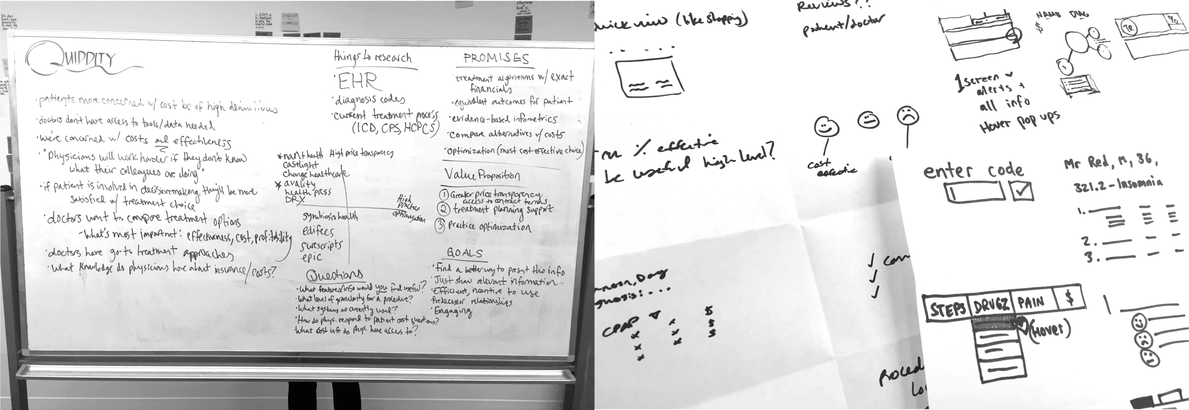
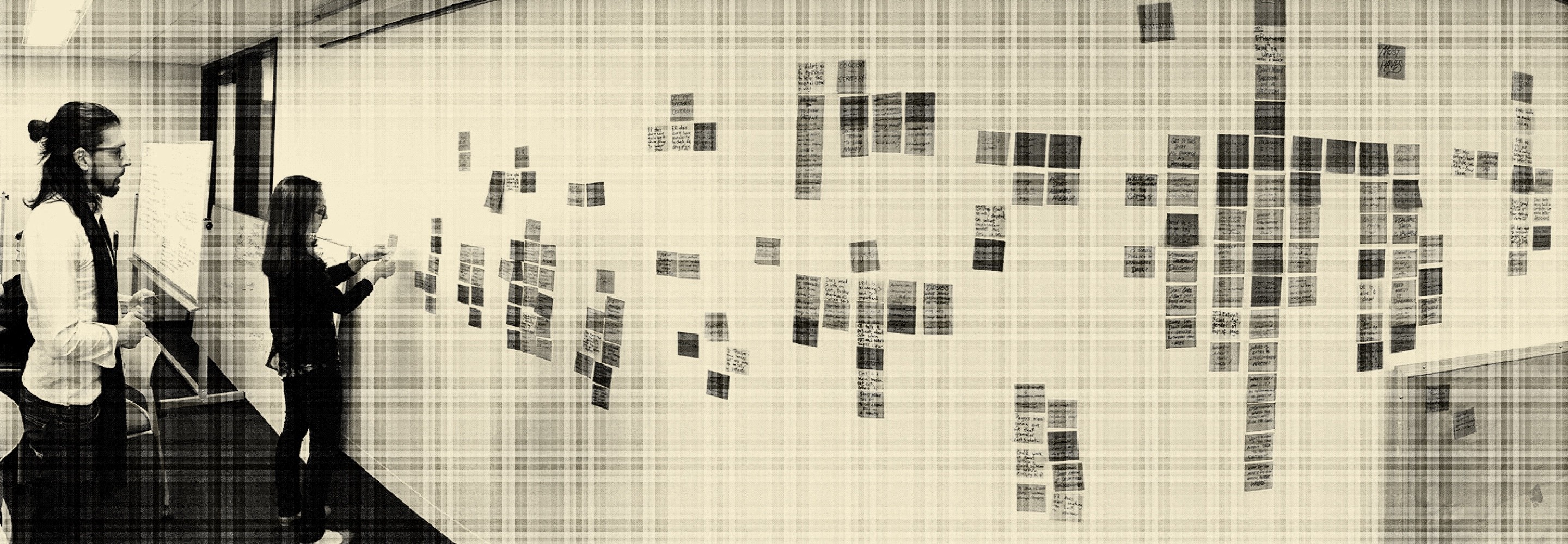
Synthesizing research and using the crazy 8's design exercise to ideate
Ideate
Each member of the team then took our respective quick ideas, and translated them into a series of wireframes as possible solutions. We experimented with several different approaches: a node based layout, a layout including all of the information into accordions for quick access and glanceability, and using a single page with hover states and more organized statistics. Due to the time limitations of the design sprint, and the very limited scheduling availability in which to test these designs with the doctors, we were constrained to only being able to utilize wall voting and client feedback to determine what features we would bring forward into our final prototype for further user testing.
Different approaches the team took for the next round of testing - node based layout, a single page with hover states and more organized statistics, and an accordion layout for quick access and glanceability
Iteration
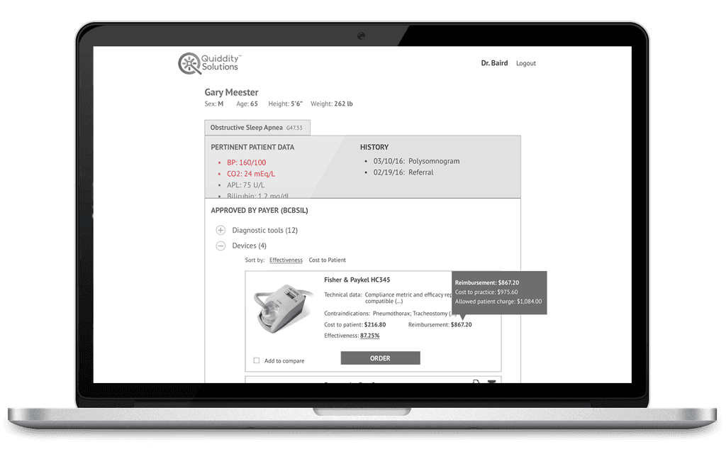
After analyzing this feedback, we made certain updates to the wireframes such as removing the email feature, and annotated them for our final client deliverable.
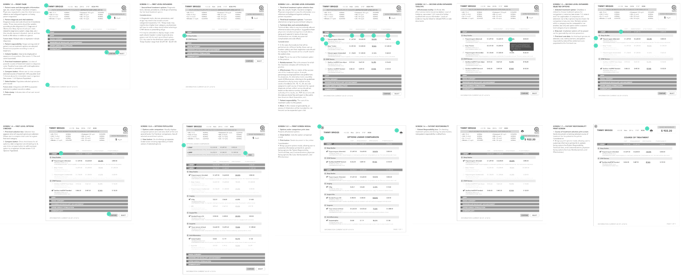
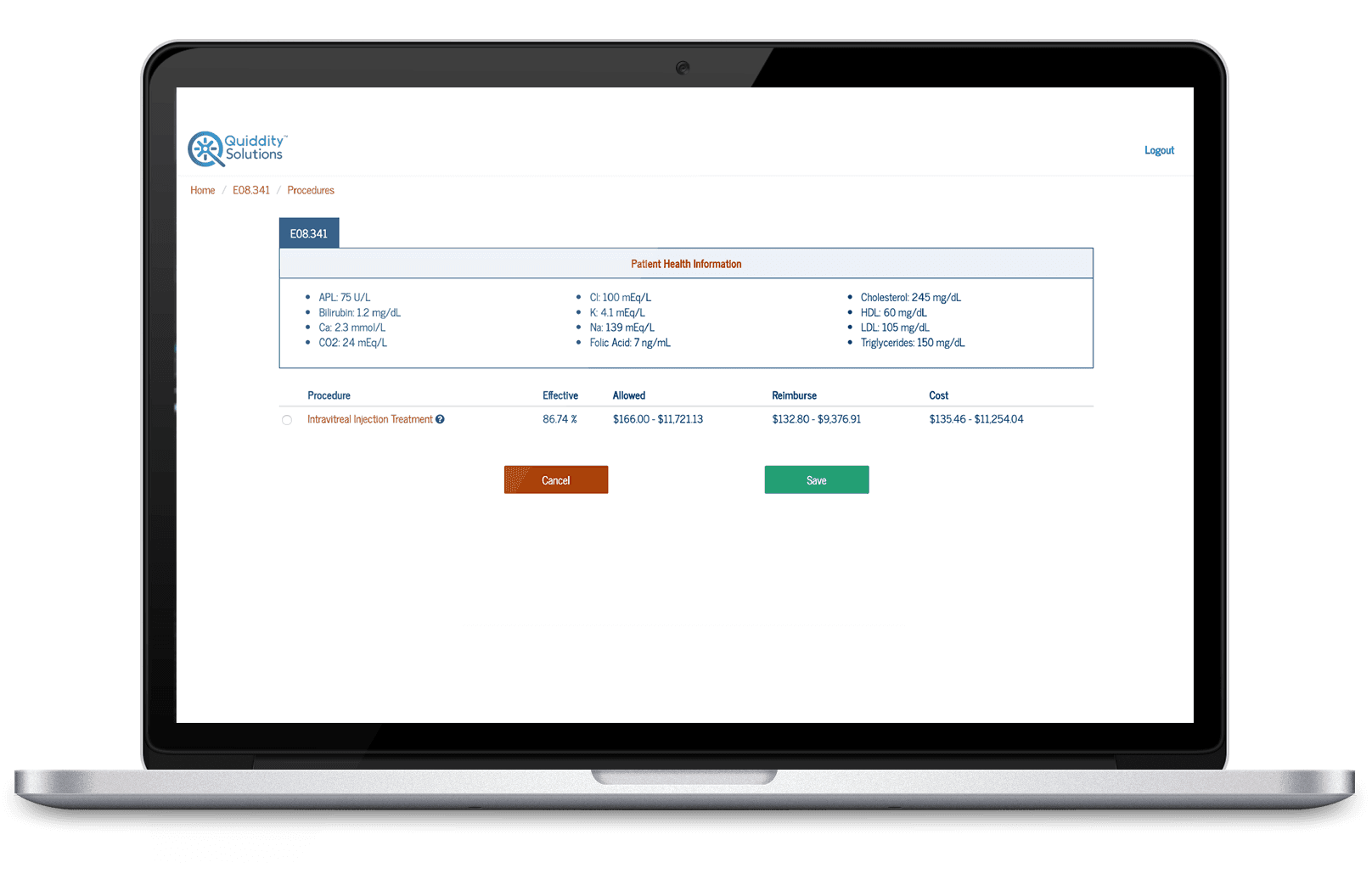
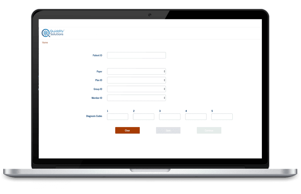
Final annotated mid-fidelity screens