UI Design
Design Systems
Team
1 Designer, 1 Project Manager, 2 Developers, 3 QA
Year
July - December 2019
Challenge
Goal
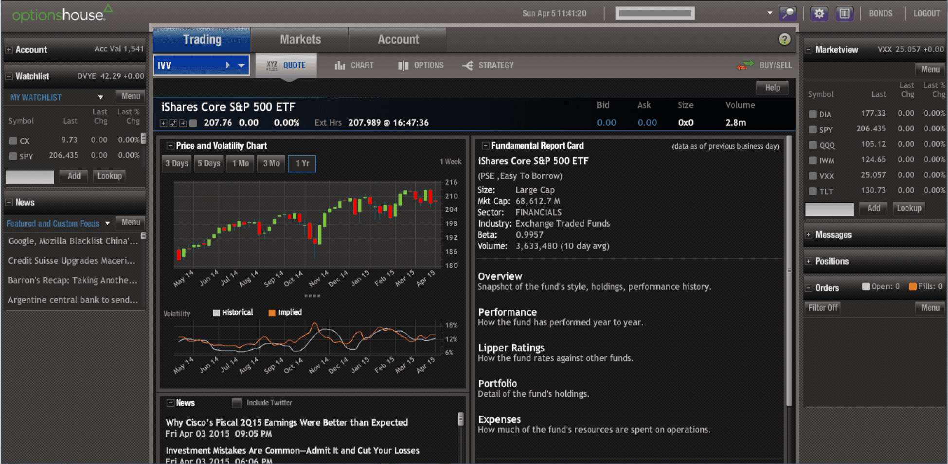
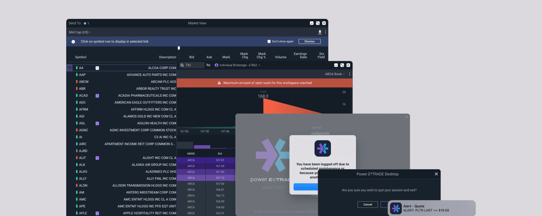
A view of the previous OptionsHouse experience
Approach
We started by coordinating with the E*Trade.com design team to see where in their design language we could align. Differences in the components and the experiences between the two platforms meant that we had to expand our color system to insure accessibility and information hierarchy.
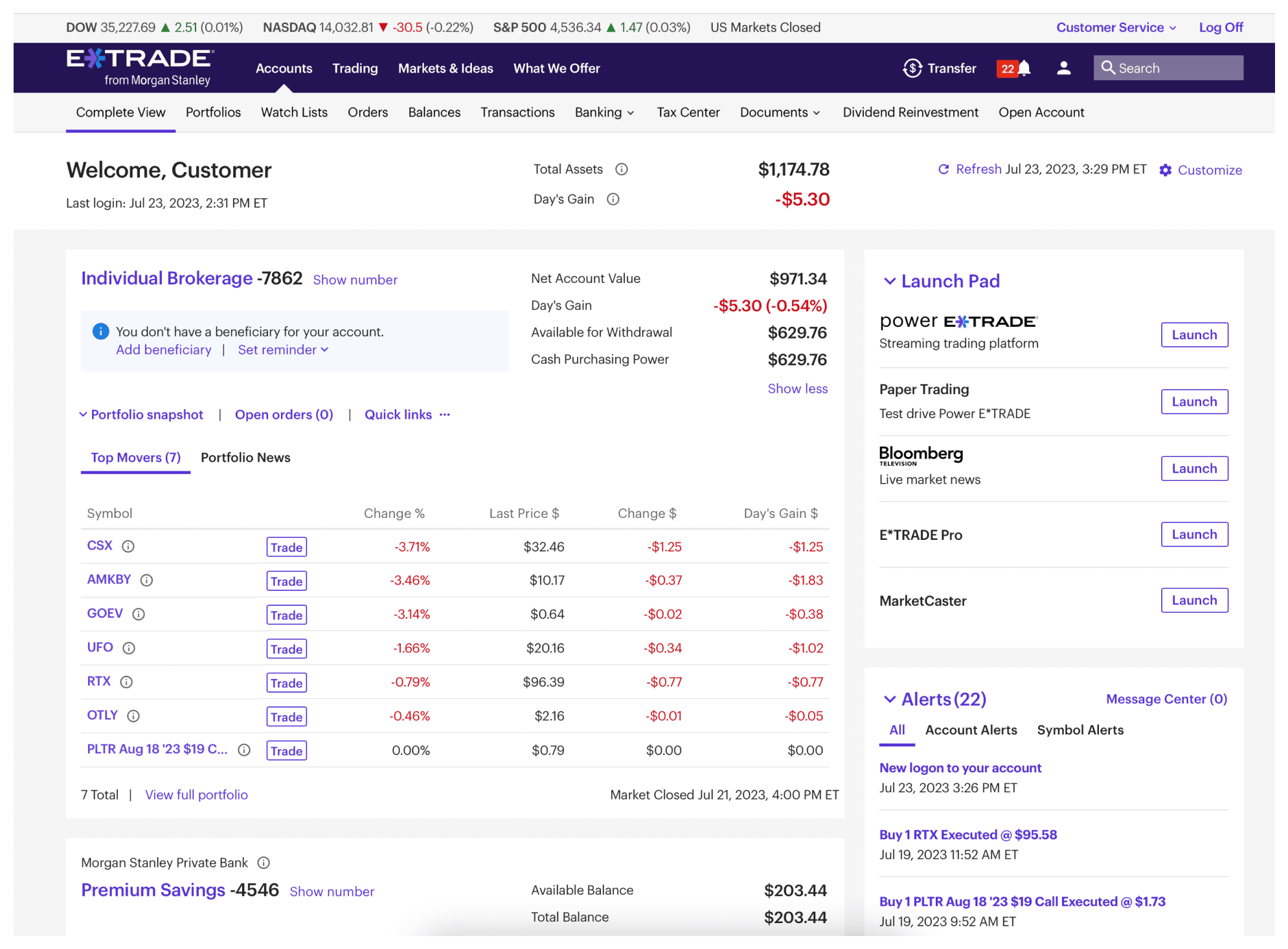
The main etrade.com site is a light theme experience, Power opens from the right side launch pad
Active traders as a user base tend to rely heavily on colors to process information that they use to make split-decision financial transactions involving large sums of money. Red and Green correspond to very specific concepts and actions on the platform, from gain and loss of the price of a stock or option, to going short or long on a position.
We kept the user’s needs at the center of the initiative, and tested and iterated on our color palette to make sure usability was paramount. Since different types of securities are traded on the platform (stocks, options, futures), we first identified and recruited across those users. We then created prototypes that covered their most common trade execution flows and used hallway and remote user testing to validate the experience. We continued to iterate and test until we resolved the common pain points we heard in testing, and arrived on a core color system that worked across the platform for all users and all scenarios.
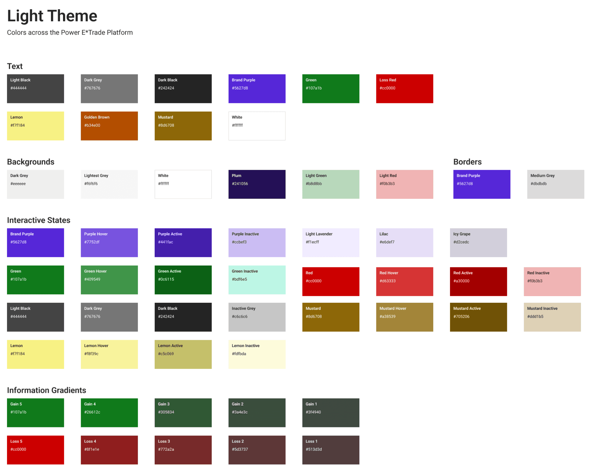
The consolidated color system, which accounted for interaction states, value change indicators, and more
Components and their interactions were defined and standardized across the site. We also audited designs and production to identify any components that were being used incorrectly (checkboxes for radio buttons, dropdowns instead of tabs, etc), and brought them into standardization. Design, product, and technology worked closely on implementation, and assurance of visual standards.
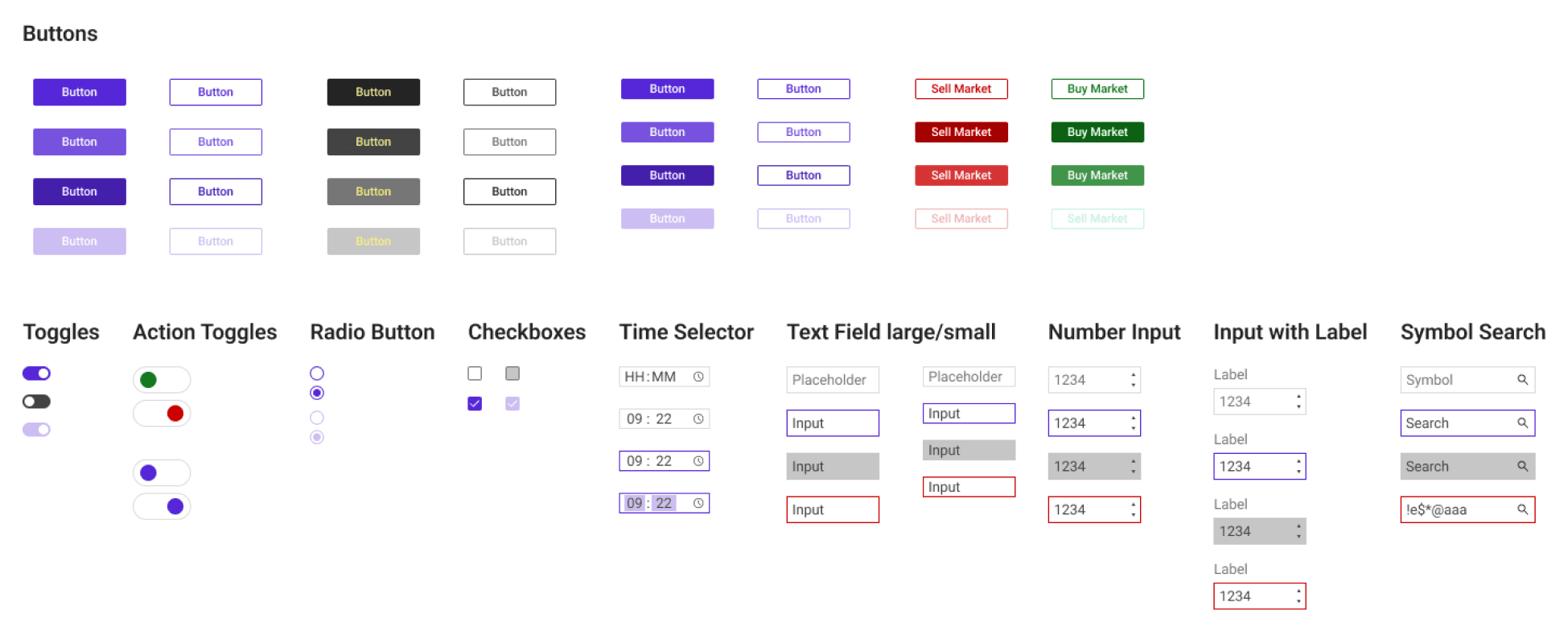
All components and states were accounted for, standardized, and defined
Impact
As a team we were able to see the impact of our successful implementation of light theme on Power E*Trade both near and long-term. Although most active traders tend to prefer dark mode experiences, user feedback was immediate and pronounced that a large portion of users actually found the light theme easier and more accessible for their trading needs.
Additionally, the light theme was instrumental in creating a frictionless conversion experience for E*Trade.com users to convert to the Power platform, leading to an exponential increase in new customers, average daily users, and all time high DARTs (Daily Average Revenue Trades, an important KPI in the brokerage industry).
Keeping an aligned and consistent experience across the platforms created a better opportunity to convert users of the main site into Power users