UX/UI Design
User Flows
Team
1 Designer, 1 Project Manager, 1 Developer, 2 QA
Year
2020-2021
Challenge
Goal
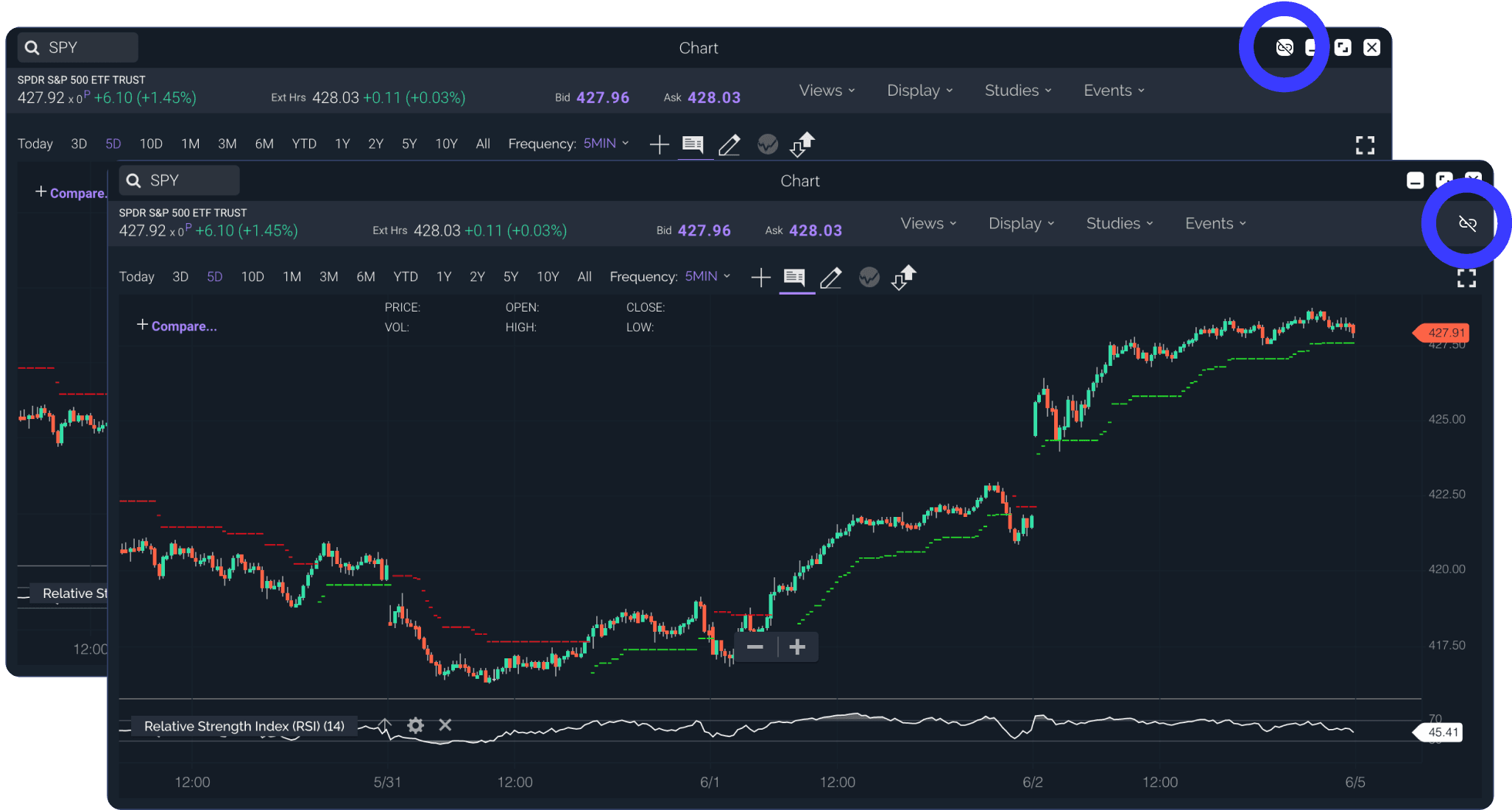
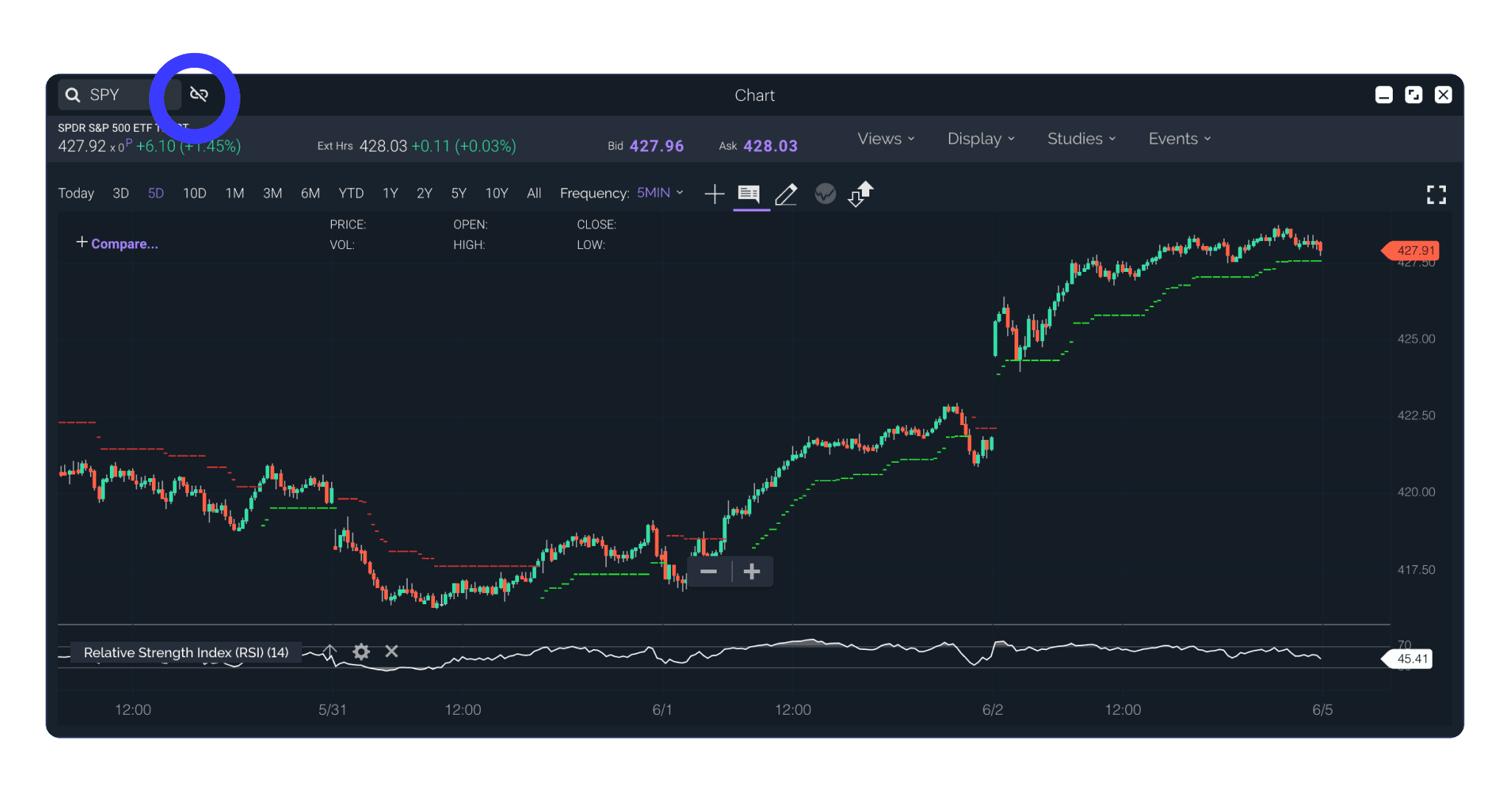
In the Power E*Trade web experience, Users can only view only one tool for one symbol at a time.
Without linking, Users would have to update each tool to the symbol they wanted to view window-by-window. Users would also need to manually type in symbols from the tools that contained data tables of symbols they are monitoring, such as Watch List or Market View.
With Linking, Users can create (up to six) modular connected layouts for quickly looking at symbol information across several tools. Users can then connect their windows containing data tables to swiftly cycle through different symbols.
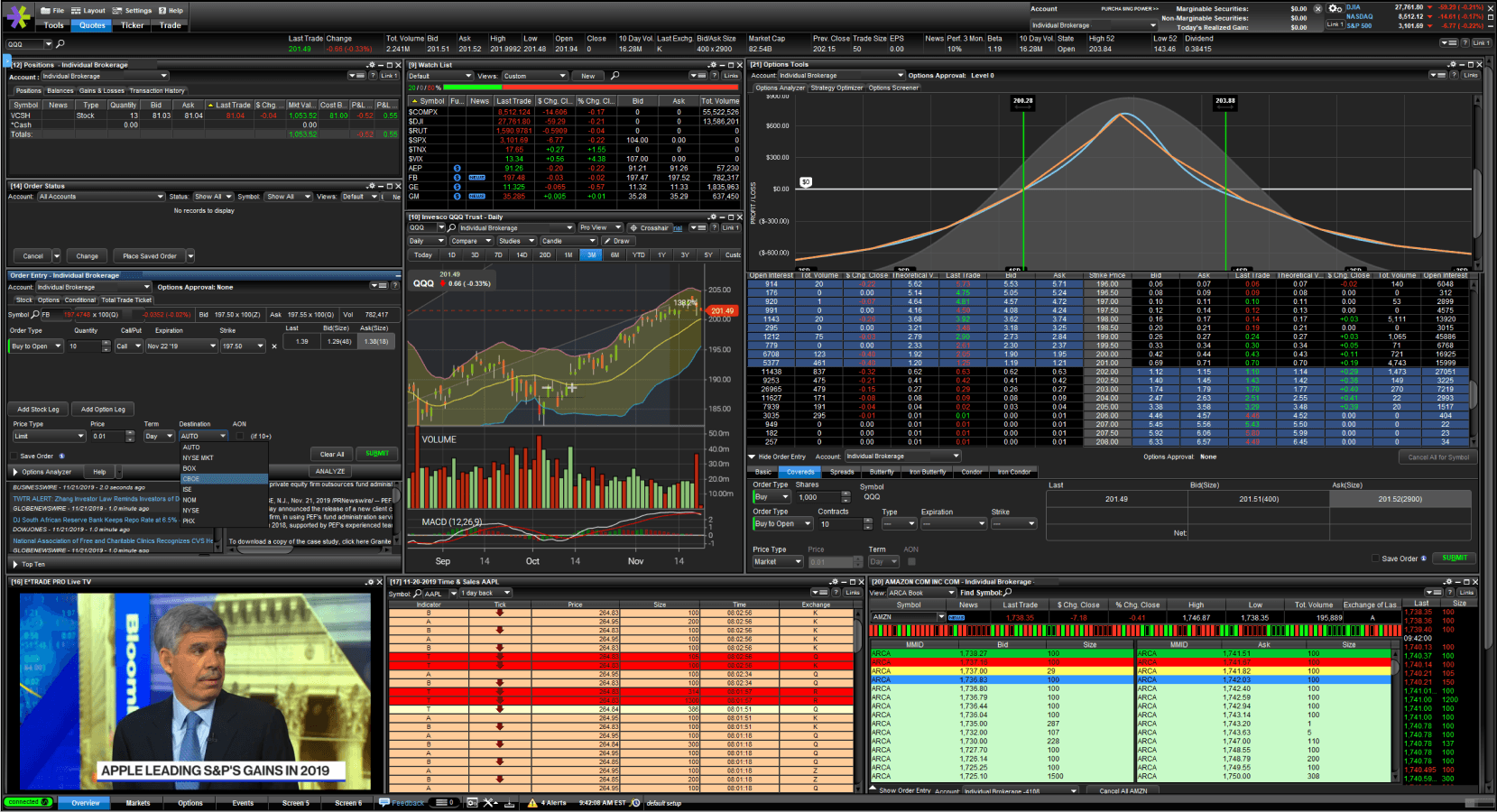
E*Trade Pro had a linking experience with inconsistent UX....
....And was not easy to find
We started with E*Trade Pro
E*Trade Pro contains a linking feature that fits the concept of our user need, however when the design and product teams audited the feature, we found that platform’s version to be very unintuitive, hard to find, and unclear on how it worked across both data tables and trading tools. However, we could use the location on Pro as a starting point, and test it.
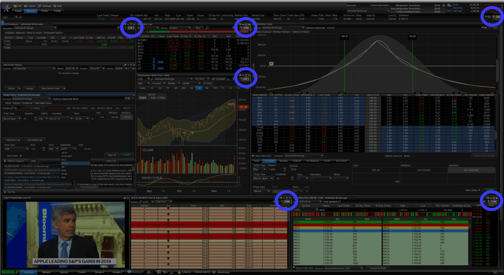
The first locations of linking were on the chrome controls (top) and with the secondary nav (bottom)
And we iterated. And tested.
We approached two possible paths - one with linking as a function of the window chrome controls, and one with linking positioned on the filter bar in the location that Pro users would be used to. We first conducted internal hallway testing with Power E*Trade web users and stakeholders to get their feedback before testing with external clients. The results and feedback from the initial testing led to abandoning the chrome concept in favor of the filter bar location, and we moved forward with doing remote usability testing with Pro users using prototypes.
...and we found some interesting things.
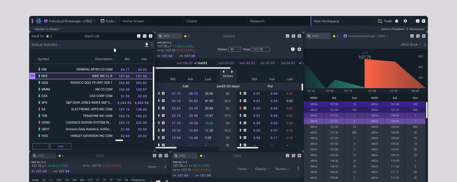
Linking was moved directly adjacent to the symbol search
...and we iterated and tested some more.
We iterated on the designs to bring linking into greater affordance with the symbol search, and after validating our designs with hallway testing, moved forward with developing that solution so we could test it in code with external users.
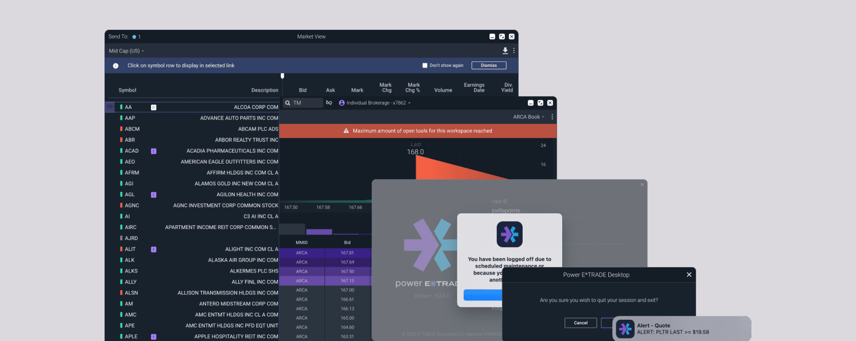
What we had found, and what would be a common obstacle for us on the project, was that testing for some features on a customizable multi-window experience can be difficult to get proper feedback due to the inherent limitations of prototypes. Users are used to being able to explore and inherently start looking around for the tools valuable to their trading style. We felt that letting users interact with the windows in the real experience would give us better insights and a more trustworthy validation. Additionally, we felt that initial testing indicated that the feature itself made sense, it was more a matter of location.
Users create a new link to the active symbol via a dropdown menu. Once the link is established, subsequent windows can be added to that link, or a new link can be created. Color and numeration are associated with the links for quick glance recognition and accessibility.
Users can continue to launch new tools and continue the link, even across separate workspaces
Any tool launched from a linked window continues the relationship, allowing the user to quickly build a connected workspace with a dedicated order ticket
Impact
Users can launch a quick action menu from various parts of the platform to quickly launch a tool or commit another action with a selected symbol. We enabled the ability to “send” the selected symbol to any linked relationship they wanted.
Later, Data tables like Watch Lists and Positions were given the ability to have a relationship with linking. Users would enter a state where the highlighted row would “send” that row’s symbol to the selected link group. Users would be able to quickly cycle through different symbols they were monitoring or look at tools relating to positions they held.